Adapt company website to align with the new brand identity
After completing a renovation of the company’s brand identity, with a primary focus on enhancing offline components, the need emerged to carry this restyling even to the online side. The primary attention went towards a comprehensive redesign of the corporate website. This strategic initiative was aimed at not only aligning the online presence with the updated offline branding but also at enhancing the overall digital experience for partners and clients.
Client
XTN Cognitive Security
Services
UX/UI Design
Release date
September 2021
Key problems
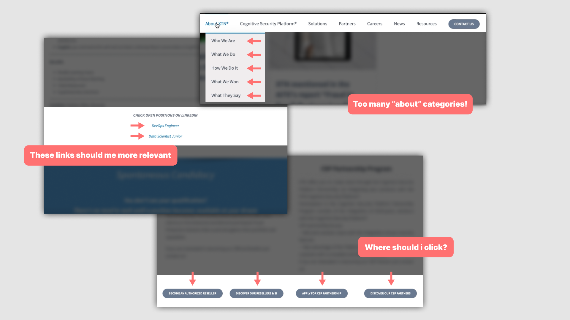
BAD UX
One of the main challenges of the old website was its disorganized and unclear structure.
Navigating through the site and finding information wasn’t always so easy.
Many call-to-action (CTA) buttons were either unclear or inconspicuous, making it challenging for users to take desired actions or explore further.
TEXT TEXT TEXT
The visual aspect of the website was often lacking, leaving large areas with only text, which didn’t immediately convey the purpose or content of each page.
This lack of visual cues hindered users’ understanding and engagement with the site. Recognizing the importance of visual appeal and user-friendly design, it became evident that a significant overhaul was necessary.
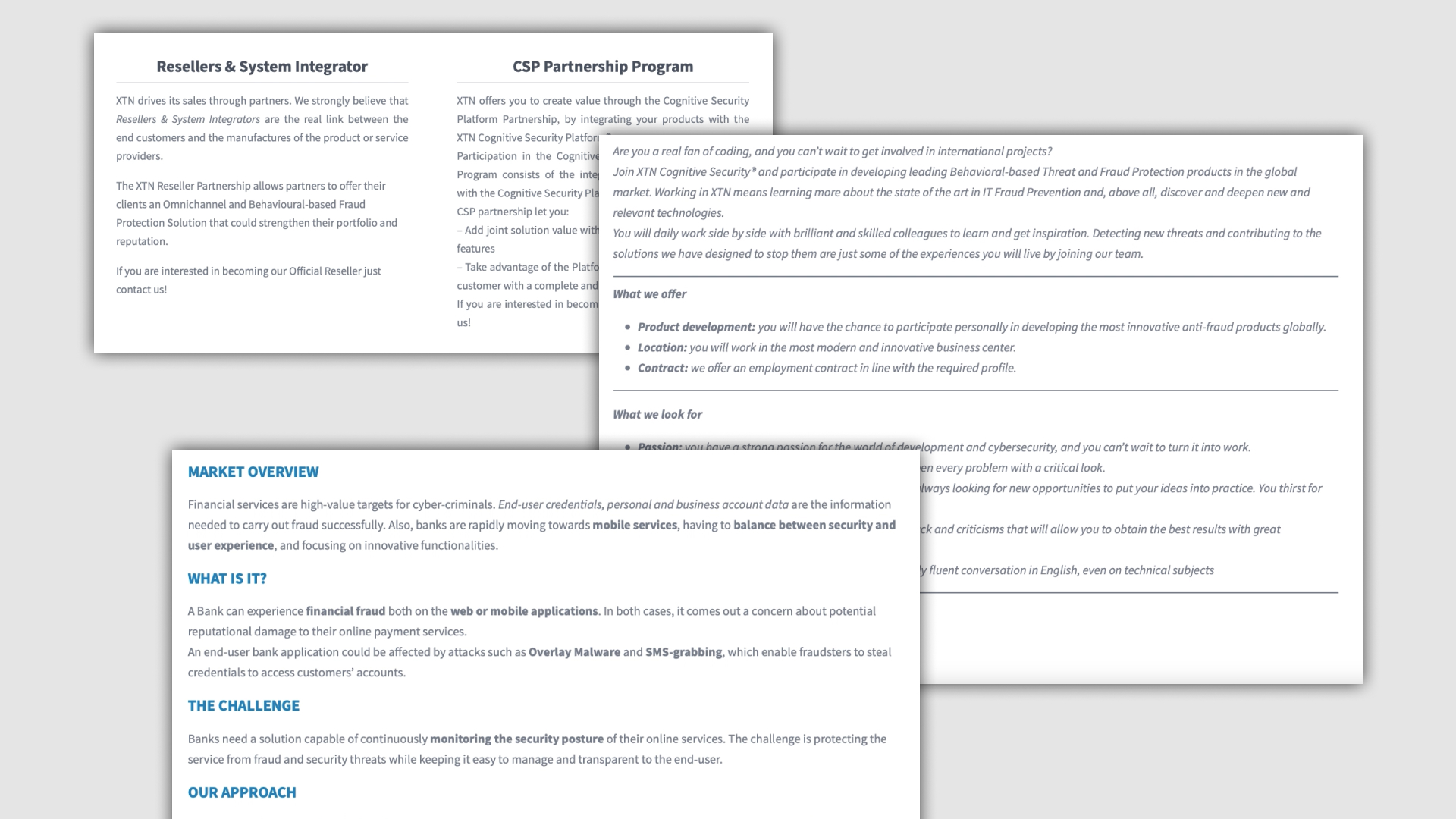
Limitations
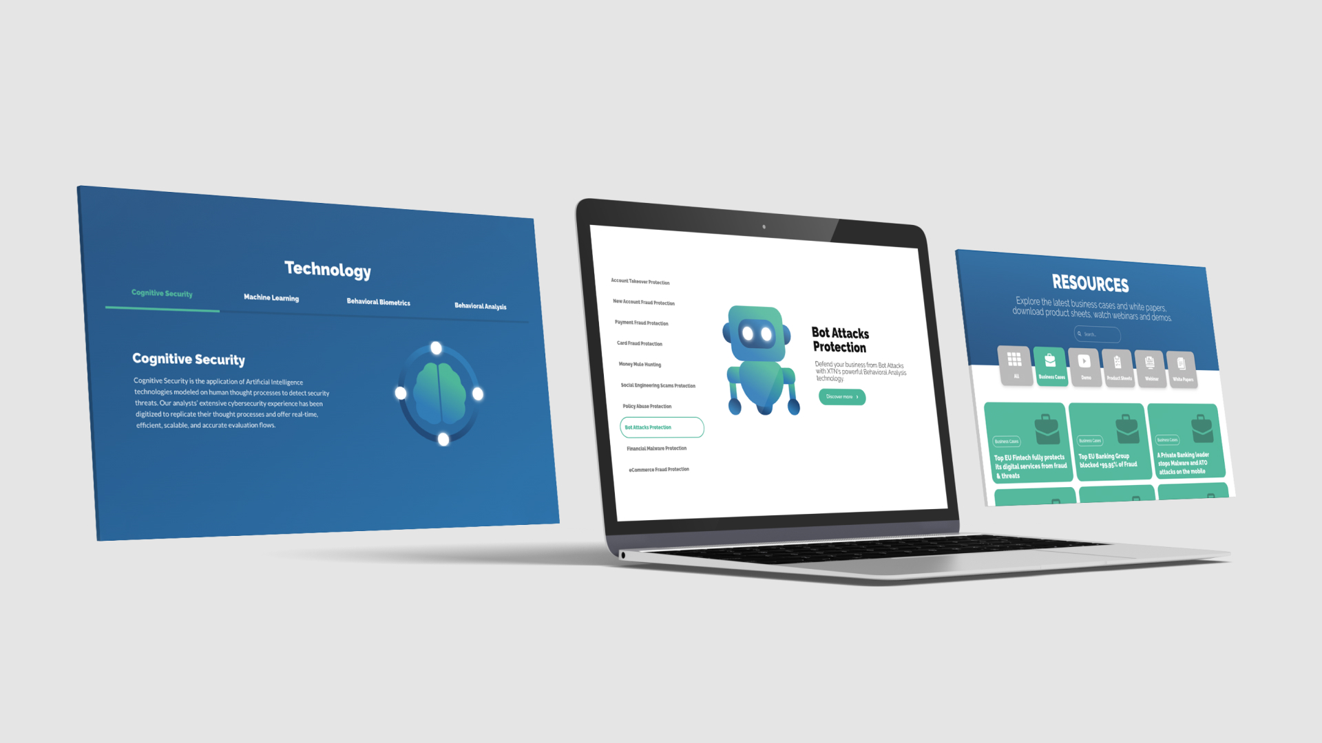
The task of revamping the website came with its own set of constraints. One such limitation was the inability to use photos; instead, we had to rely on illustrations or graphics created in-house. This requirement added an additional layer of creativity and artistry to the project, ensuring that the visual elements seamlessly complemented the overall design and messaging.
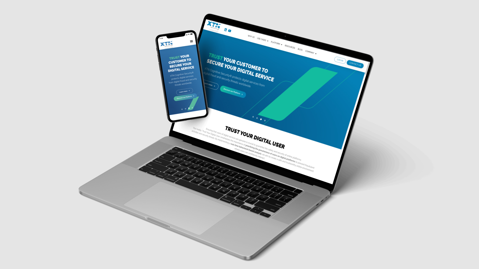
Prototyping and Implementation
In the pursuit of a comprehensive corporate restyling, we addressed these challenges head-on. The first step involved reimagining the website’s structure, implementing a clear and intuitive navigation system. Important information and CTAs were strategically placed to guide users seamlessly through the site, ensuring a seamless user experience.
Following the website restructuring, we developed prototypes, refining the user flow through wireframing and interactions.

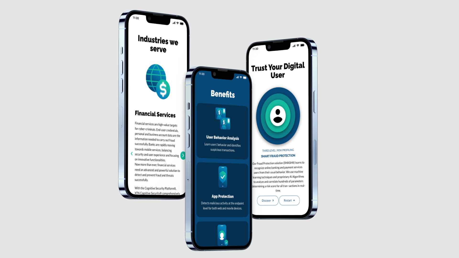
To address the lack of visual elements, we invested in creating captivating illustrations and graphics that not only enhanced the visual appeal but also provided clear visual cues to help users understand the purpose of each page at a glance. By striking a balance between aesthetics and functionality, we were able to create a visually engaging and informative website.
As part of the corporate restyling initiative, we aligned the visual design with the company’s brand identity, integrating consistent branding elements throughout the website. This cohesive approach ensured that visitors experienced a unified and recognizable brand presence, instilling trust and credibility.
Results
The result of these modifications and innovations is a transformed website that offers a streamlined user experience, clear navigation, and visually appealing content.
This project combined with the creation of a new marketing plan that you can explore here, proved to be a game changer. Our main goal was to provide our sales team with as many targeted contacts as possible. This was a challenging but satisfying journey. In my final year there, among all the different channels we focused on, we achieved an increase of +440% compared to the previous year.
Click here to visit the website!